October 24, 2014 (Updated February 5th, 2025)
Behind the scenes with Cover Images

*PLEASE NOTE – DropTask is now Ayoa – an all-in-one tool for idea generation and collaboration, that goes beyond traditional task management. Discover Ayoa and achieve your best work.*
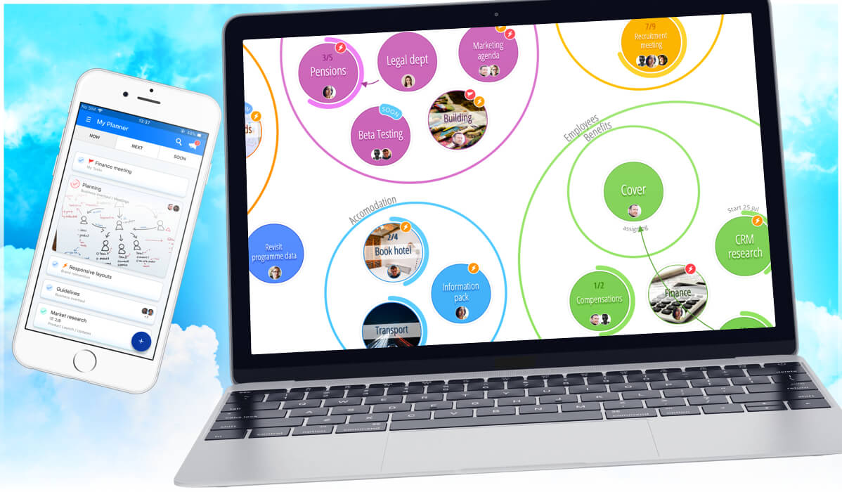
As we’re sure you know by now, last month we updated the DropTask interface by giving it a beautiful makeover and added some exciting new features in the process. One of those was cover images, a refreshed way of differentiating and personalizing your tasks. A few months were spent developing and perfecting the feature, and today we thought we would give you a little preview of what takes place behind the scenes at DropTask HQ when we produce any new functionality, from planning through to release! Before we begin however, can we all just take a moment to appreciate how good food looks within tasks? Those sandwiches…
Now we’ve taken that moment to drool over 2D food, let me take you back to the start of cover images. As with any new creation, the first step came from an initial idea. Not all of the ideas we have come to fruition however, as we first need to determine whether or not the additional feature will benefit yourselves as users. It is only after this process that we can move forward with planning. We thought that cover images would make tasks easier to locate, whilst adding an element of personalization. Using images to distinguish tasks would also enhance visualization and the ability to glean a project overview with one glance. With this in mind, we were sure the feature would add real value to your experience of DropTask and we got to work with the planning process.
From the marketing team’s perspective, we thought it would be as simple as placing images into the background of the default task shape. As you can see above, the devs soon proved us wrong and highlighted a number of issues with this process. It became apparent that images would obscure the text, and although we tried to work around this, it was clear something had to change. With most images being rectangular by nature, the circles just weren’t cutting it and we needed a larger surface area in order for the images and task attributes to render correctly. We started to dabble with straight edges and longer lines, and although the images certainly looked better and the information was clear – the tasks were no longer recognizable as part of DropTask!
It was then time to go back to the drawing board, quite literally, in order to think of something better.
It was at this point that the task began to take shape and we created the first version of the rounded square you’ll be familiar with today. With approval from Darren – our Head of Development, the devs began working on the functionality of cover images within DropTask itself. While our software developer Ben, handled the visual side of things, Mike, another one of our software developers, got started on the ‘cropper’ that would be used to fit the images into tasks. Once this development stage was complete, it was time for the fun part – testing! Not so fun for poor Ben and Mike however, who both spent this period fuelled by above-average coffee consumption in order to implement all the changes necessary based on the team’s feedback (sorry guys!). Once all of us were finally happy, we released cover images to a set of PRO users for further testing.
With all final edits complete and any glitches ironed out (cue a large sigh of relief from Ben and Mike), cover images were ready to go!
Now we’ve been using cover images for a few weeks, we can’t imagine DropTask without them! We hope you’re all having fun with this new feature and, most importantly, that they’ve enhanced your user experience by making your tasks easier to locate thus saving you both time and effort.
If you haven’t already, head to DropTask and check out cover images right now. Even if you have, why not go and admire them again in all their glory. And if you like them, let us know – your lovely feedback is what keeps the devs going during those dark, caffeine driven times just before a new update is released…
